1 min read
How to Get Started with Viva Topics
Do you have trouble finding information on your intranet? Or spend a lot of time trying to find the right person who might have the information? Viva...
3 min read

When I redesigned intranets built on classic SharePoint , I would spend months untangling the web of sites and sub-sites. The “trick” back then was to use managed metadata navigation to decouple the physical architecture from the information architecture. Now, Microsoft has not only flattened the SharePoint physical architecture, but they have also done a good job of decoupling the information architecture and building good information architecture practices into the application. The following will help you leverage the out-of-the-box capabilities to make a more engaging intranet.
The best intranets focus on end-user topics and tasks. The problem is that the intranet is often designed and built by the handful of users that will be updating the content and maintaining the system. If you are building a new intranet, the best way to try to avoid this problem is to get your end-users involved in the requirements through surveys and focus groups, and then use the information below to help you build an engaging intranet. If you are looking at the usage statistics on your existing intranet, or worse, reading through complaints or negative suggestion box entries, try the steps below for a quick win!
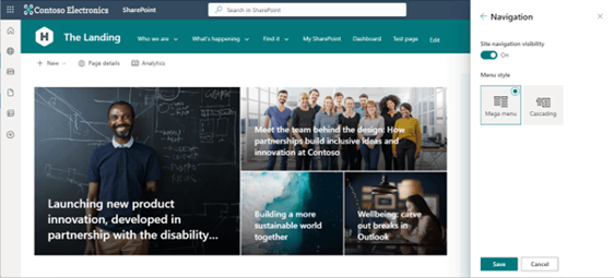
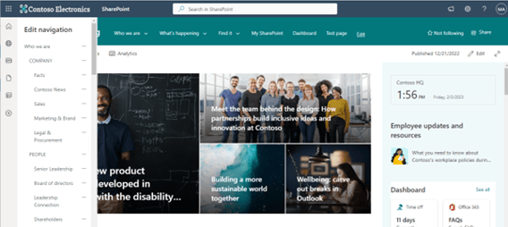
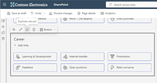
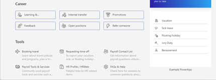
One of the sources of user frustration is clicking down thru multiple layers of navigation only to realize that they went down the wrong path. The Mega Menu allows you to surface more information for them to scan and be more likely to pick the right path.
How to access the Mega Menu option:
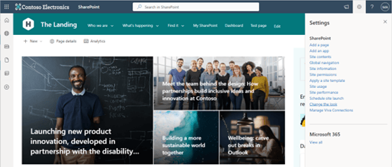
The Hero web part is not just for the home page! This is a great point and click feature that adds visual interest to your pages with little effort. If you have landing pages for large topics or departments that mostly contain lists of links, try the hero web part to highlight the most important pages. If you don’t want the pages to look like the home page, try the “Layers” layout options to make it more interesting and easier to scan. Remember, users do not like to read lengthy text lists.
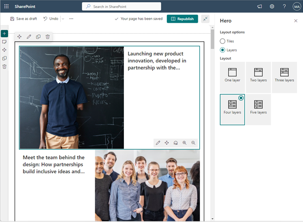
If you have too many links and the Hero web part doesn’t look like it will work for you, try breaking up the list and mixing some different layouts on the same page.
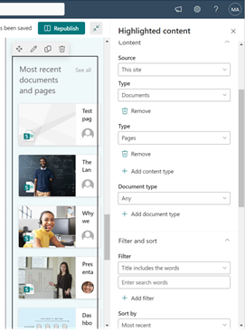
Let’s face it, people are not going to scan thru every page and document library to figure out what has changed since the last time they visited the intranet. Instead of creating a news article to announce every change, let SharePoint do it for you!
Speaking of letting SharePoint do the work for you, why not let AI help you organize your intranet content and more! Check out Viva Topics and see my earlier blog: How to Get Started with Viva Topics. This will take a little more effort, but payback in significant dividends over time. If you are still not seeing the benefits of your intranet, contact us today- we are happy to help!

1 min read
Do you have trouble finding information on your intranet? Or spend a lot of time trying to find the right person who might have the information? Viva...

1 min read
As many organizations embrace artificial intelligence to help drive search experience, it’s almost impossible not to think of how leveraging...

1 min read
This blog is a follow-up to part one of this series, where we are providing a how-to guide to create a PowerApp that extends the functionality of...