.png)
Covid-19 Data Sets
How many 45-year-old individuals of Hispanic descent with A+ blood type have been diagnosed with Covid-19, and for how long were they sick? How many of them died? What percentage of people that got put on ventilators got better? How many of the deaths have been people that are smokers or were diabetic? What behaviors or conditions exactly correlate high-risk patients? All these questions would be helpful for the general public to feel more at ease with how the disease is presenting itself and being handled.
The government is presenting macro-level data regarding number of cases by state, by country, number of deaths, etc. They need to do that from a supply-chain perspective so that they can make sure they are staying ahead of the various demands of those locations. However, all the information (micro-level data) necessary to answer the more detailed questions above is in fact available. Creating the data sets for specific analysis like that is complicated, but very doable. We help many types of organizations perform advanced analytics on their data, so why not Covid-19 patient data? It is actually an argument as to why the federal government should be managing all US Citizen Electronic Health Records (EHR). At this time, depending on what systems are being used by your healthcare provider, that is where your EHR resides and even then, they are typically disconnected from one another.
Once the data sets are created, presenting that information in meaningful ways to researchers and even US Citizens in general can easily be done by leveraging Microsoft’s Power BI (or even something like Tableau, Looker or Jupyter Notebooks).
I am by no means a healthcare expert, but we put together an example of what this might look like by leveraging Power BI. The insights being provided are examples only, and the data itself is not real as it was just created as an example of a data set without getting any actual information from any agency, but they give you an idea of the types of scenarios that can be generated.
Spyglass MTG has the capability to help our healthcare clients curate their data, or data provided by various government agencies, securely and efficiently into functional models that can be easily reported against in this way.
The Commonwealth has come a long way in their presentation of the data (see the website here), but there is so much more that can be done at the healthcare provider level, the state level, or even nationally and globally. I truly hope that this is all currently being done by someone, someplace, and I am sure that it is. I will be looking forward to the day when it is shared with the world.
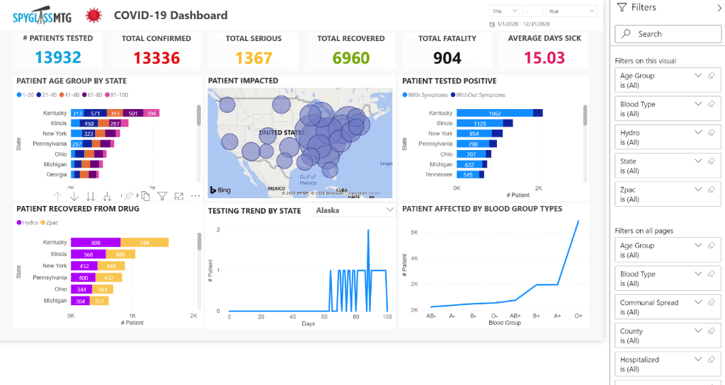
This example is of a National Covid-19 Dashboard:
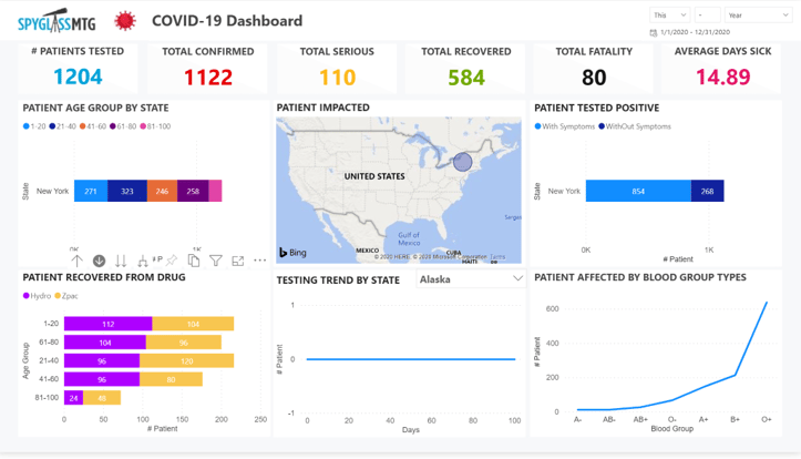
From the overall dashboard, you can drill down into a specific area. In this case, we drilled down on New York in the “patient recovered by drug” visualization:
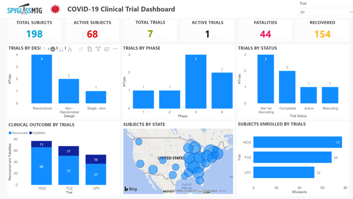
This next example is more specifically targeted at clinical trial information:
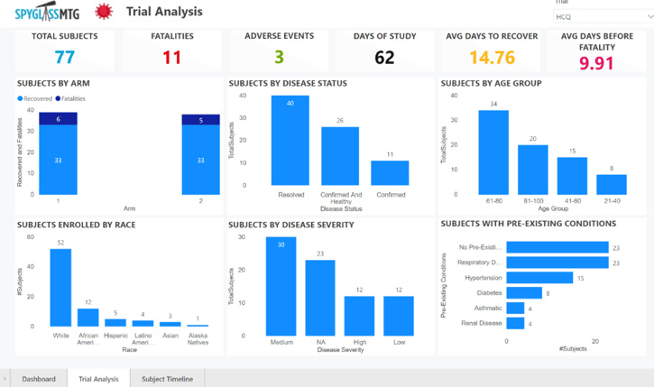
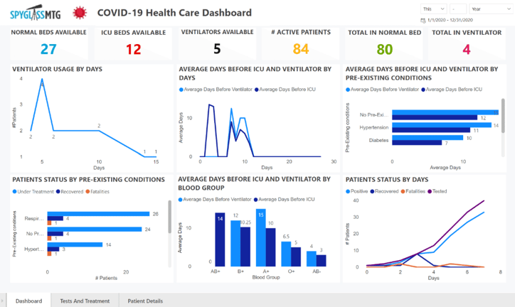
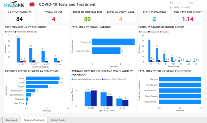
And finally, an example of what it might look like if this were to be deployed at a particular healthcare provider:
Interested in discussing this topic more or learning how we can help your healthcare company? Contact us today!